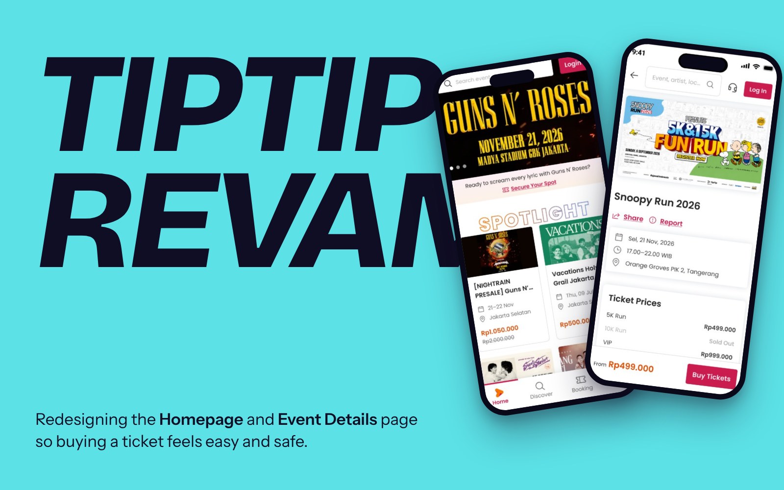
Orbit Clash
A game detail page for a made-up browser game, built around one idea: let players try the game before they decide.
Players leave when they’re not sure a game is fun.
The brief: design one desktop page for a made-up game that explains it, excites players and gets them to press play.
Most game pages miss one side. Browser game portals let you play instantly but say almost nothing. Game stores say everything, but they’re built for buying, not trying.
From curious to playing in under a minute.
- Explain what the game is in one glance
- Excite by showing why it’s fun, not telling
- Convert with one clear next step in every section
Look around first, then decide.
I benchmarked game stores, browser game sites and game websites on the web and through a connected MCP, and kept one idea from each:
Market data, then three players to design for.
The numbers backed a quick one-button game: 99% of browser playtime goes to hypercasual or puzzle games, an average session is about 30 minutes, and 69% of players are fine with cosmetic purchases.
From that I wrote three quick personas. They’re not from interviews, so I treat them as a starting point to test.
What I designed, and why.
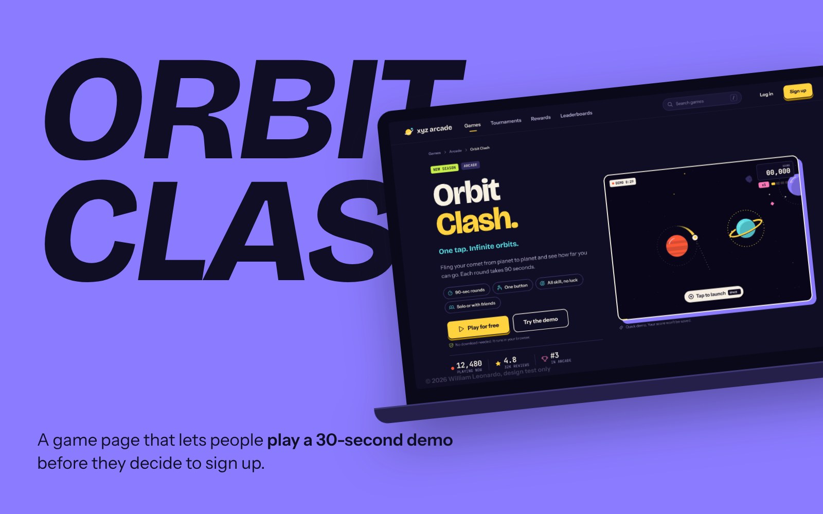
Let them play right in the hero
Players decide fast. Instead of a trailer, the hero holds a 30-second playable demo with no sign up. Right under the title, quick tags answer “does this fit my day?”: 90-second rounds, one button, all skill, solo or with friends.
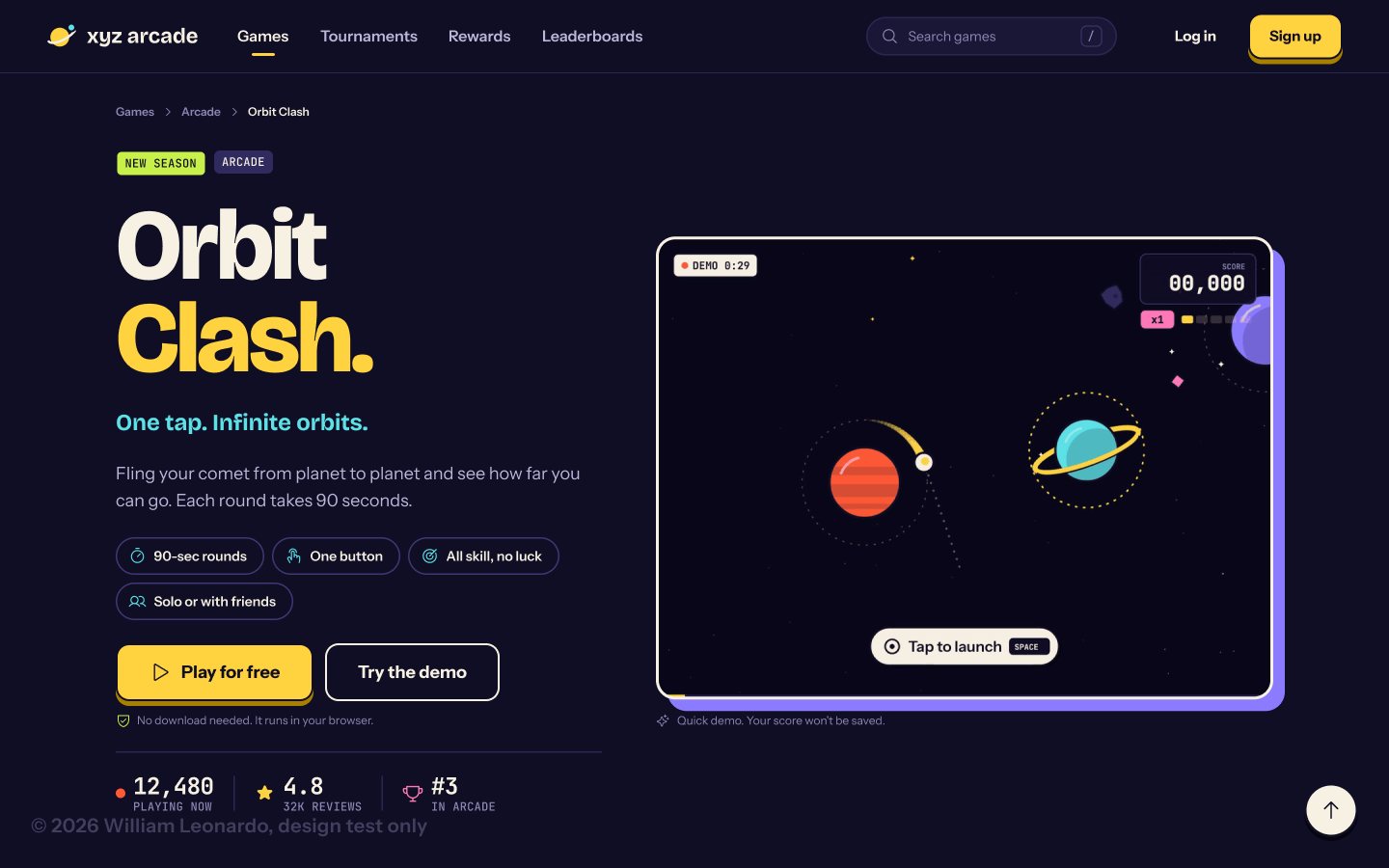
Order the page by the questions players ask
Every section answers one question, from “What is it, and is it fun?” down to “Ready?”. How to play, modes, who’s playing, what it costs, reviews, then details and FAQ. Each section ends with something to click.
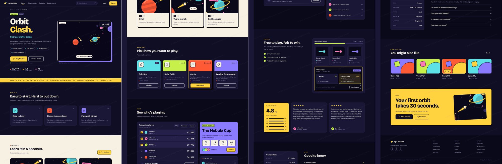
Make it feel like people are actually playing
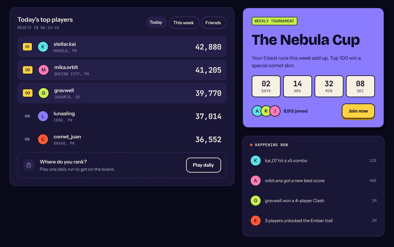
Players in the region watch streams and like playing with others. A live ticker, today’s leaderboard and a weekly tournament countdown show the game is alive, and give Adi something to climb.
Say it out loud: everything you can buy is looks only
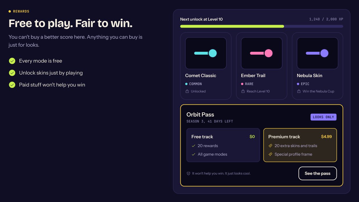
Players are fine paying for looks but hate pay to win. The rewards section leads with “Free to play. Fair to win.” and labels the season pass Looks only. In a skill game, the leaderboard is the product.
One yellow button, always within reach
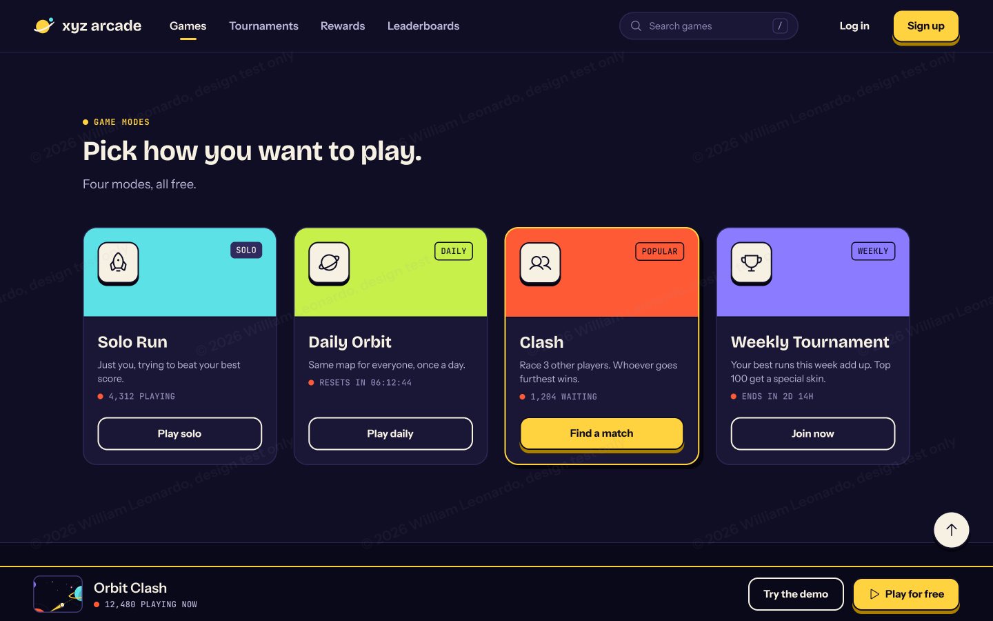
Each section has one main yellow button; the other option is the demo, an easy yes. Once you scroll past the hero, a sticky bar keeps both close. Returning players see Keep playing instead.
Built to be measured, not just admired.
This is a self-exploration, so there’s no live data yet. Here’s how I would know the page works:
- Demo start rate: how many visitors try the demo
- Demo to sign up: how many demo players create an account
- Time to first play: seconds from landing to playing
- Day 1 and Day 7 return: how many come back
- Pass conversion: how many players buy the season pass
The Figma file is built to hand off: 49 tokens, 20 text styles and 20 components, all in Auto Layout, with every state as a component variant.
Three days is enough to decide, not to be sure.
The personas came from market data, not interviews. Before trusting them, I’d run quick chats with five players per persona.
Next I’d test the hero with the demo against a still image, whether the demo replaces Play for free or warms players up, whether the season pass hurts trust, and the mobile version of this page.