BorderlessVPN
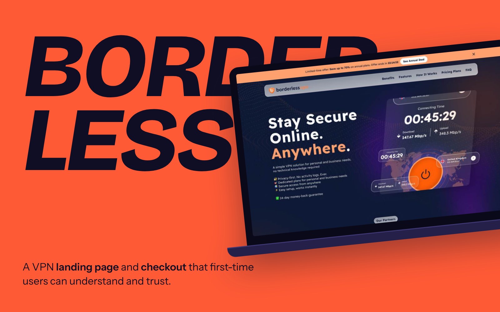
Redesigning a VPN’s landing page and checkout so first-time users understand the risk, pick the right plan, and subscribe with confidence.
Most VPN websites feel overwhelming and hard to trust.
They lean on technical terms, long feature lists and aggressive pricing. For non-technical users, it’s hard to tell what a VPN actually does, and why it matters to them.
Most people also don’t realize how often their data is exposed through breaches, public Wi-Fi or everyday browsing. If users don’t recognize the risk, they won’t understand the value.
Make online security feel simple, and worth paying for.
- Understand what a VPN does in plain language, within seconds
- Choose the right plan without comparing a wall of options
- Subscribe knowing exactly what they’re paying for, and what happens if it’s not a fit
From awareness, to understanding, to action.
Instead of selling a VPN right away, the page first helps users recognize the problem, then introduces the solution.
Three frictions behind the decision.
What I designed, and why.
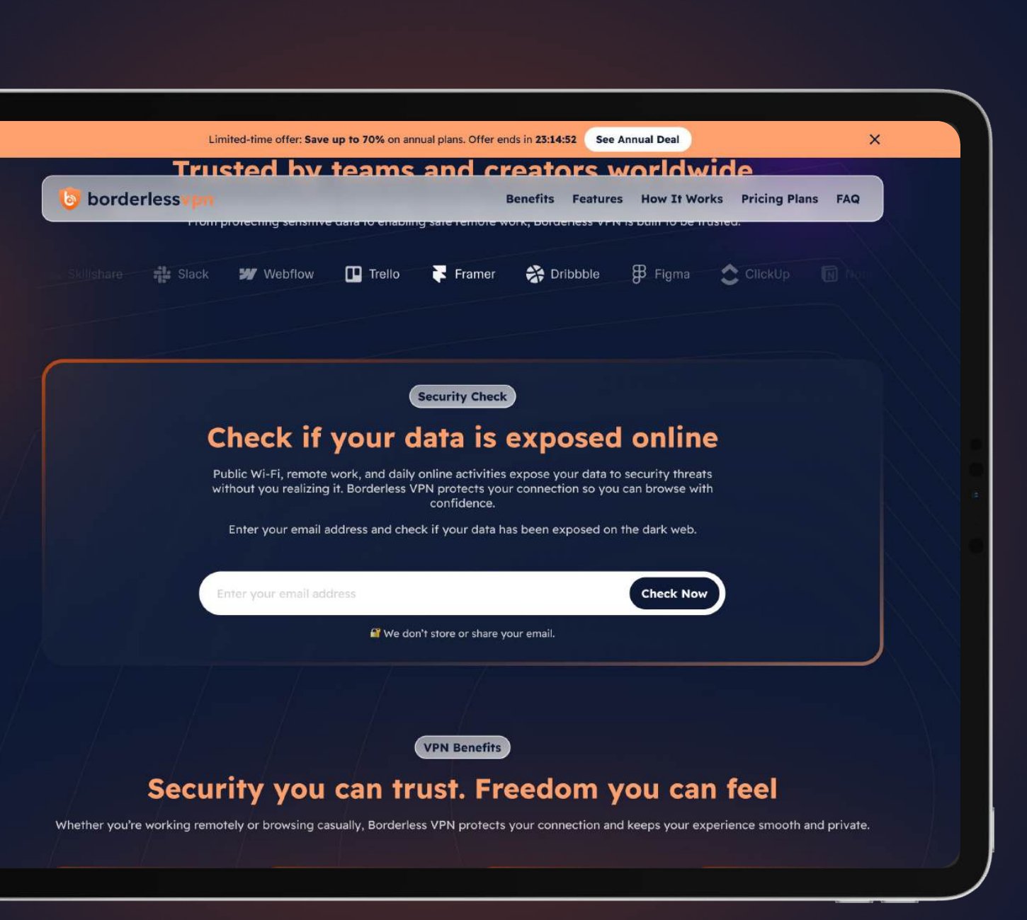
Show the risk before selling the product
A Security Check lets users enter their email and see whether their data has been exposed. It reframes the VPN from a technical tool into an answer to a real, personal risk.
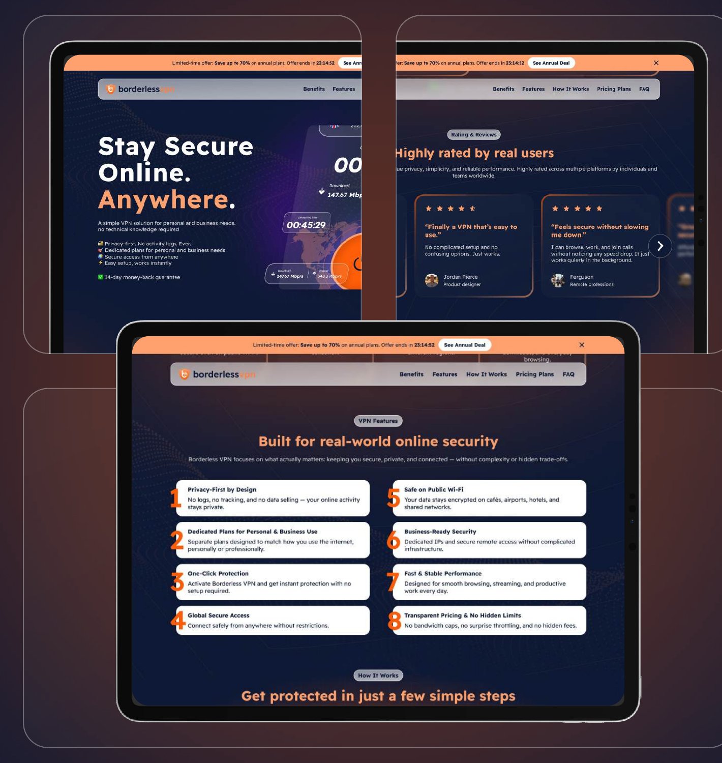
Value in seconds, benefits before features
Clear headlines and simple language explain what BorderlessVPN does at a glance. Benefits come before specs, and trust signals like reviews and privacy-first messaging lower skepticism. The limited-time offer stays in a subtle sticky bar, never in the way.
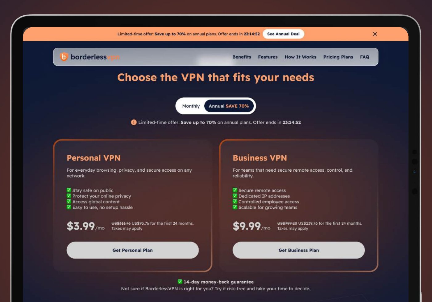
Personal or Business first, then the price
Before any pricing pressure, users pick Personal or Business. Each plan is clearly defined with fewer choices, and the 14-day money-back guarantee sits right under them.
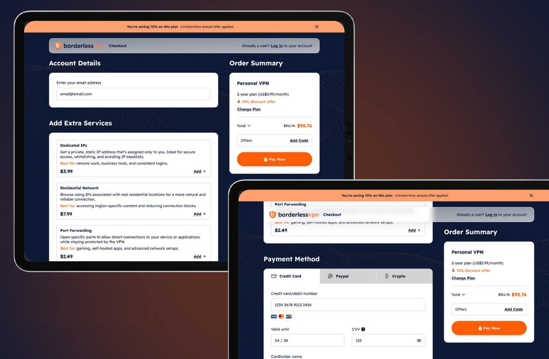
Checkout as a trust moment
A dedicated checkout keeps focus. Order details, discounts, renewal terms and the guarantee stay visible the whole time, and subscription terms are written in plain, human language.
A calm system for a nervous topic
Readex Pro for clear, friendly type. Dark blue for trust, orange to guide attention, and white and neutral grays for readable, content-heavy sections.
From high friction to approachable.
This is a self-exploration, so there’s no live data. The redesign focused on three shifts:
- Less technical complexity: outcomes first, jargon last
- More transparency: pricing, renewal and refund terms always in view
- A clear split between personal and business use
Understanding comes before conversion.
When users understand the risk and trust the solution, conversion becomes a natural outcome, not a forced one.
Next I’d test the Security Check against a classic hero, and see how much clearer plan choice and visible terms change checkout completion.